The Psychology of the Sad Beige Lifestyle: Why Everything Looks the Same Now
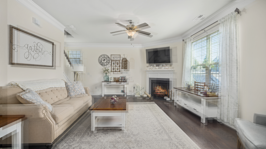
You enter another friend's apartment. Gray floors, white walls, beige couch. The fiddle leaf fig stands in the corner, exactly where you expected it. This phenomenon extends beyond mere coincidence—you're witnessing the same apartment repeatedly, across different cities, different buildings, different lives.
Welcome to the sad beige lifestyle, where individual expression has been systematically replaced by a homogeneous aesthetic formula.
The Emergence of Environmental Uniformity
The standardization of living spaces began accelerating approximately five years ago. Coffee shops across metropolitan areas suddenly adopted identical design elements: Edison bulbs, subway tile, reclaimed wood. Every vacation rental property mirrors the same aesthetic. Every "luxury" apartment complex features identical gray vinyl flooring masquerading as hardwood.
This phenomenon has extended beyond architecture into personal presentation. Wardrobes now consist of "elevated basics" in "neutral tones." Living rooms showcase the same furniture from the same retailers. Social media feeds display meticulously coordinated color palettes that prioritize visual consistency over authentic expression.
The world hasn't organically evolved toward dullness. This represents a deliberate collective choice, and the psychological mechanisms underlying this choice reveal concerning implications for human creativity and well-being.
Neurological Responses to Environmental Monotony
Contemporary research illuminates the profound neurological impact of uniform environments. A study from the Frontiers in Psychology journal demonstrates that environmental uniformity significantly affects cognitive function. When surrounded by homogeneous visual stimuli, individuals exhibit decreased creative thinking capacity and reduced willingness to engage in risk-taking behaviors.
Researchers have termed this phenomenon "aesthetic learned helplessness"—a state where the brain essentially surrenders its capacity for meaningful environmental engagement.
Consider the social implications: individuals now apologize for "chaotic" bookshelves simply because the books aren't color-coordinated. The mere presence of books that appear to have been actually read, rather than curated for visual impact, has become a source of embarrassment. This represents a fundamental shift in how we relate to our possessions and spaces.
Economic Drivers of Aesthetic Homogenization
The prevalence of beige isn't accidental—it represents calculated economic strategy.
Property developers have discovered a profitable formula: spaces designed to resemble boutique hotels command boutique hotel prices. Gray flooring photographs well for online listings. White walls won't "date" the property photos. Every design decision optimizes for the hypothetical future occupant rather than the actual current resident.
A developer interviewed for this research stated directly: "Personality doesn't scale." This admission reveals the underlying truth—living spaces aren't designed for individuals but for an abstract concept of universal appeal.
Contemporary apartments serve not their inhabitants but the market itself. They're engineered to be instantly forgettable upon vacancy, ready for the next tenant willing to pay premium rates for beautiful emptiness.
Algorithmic Influence on Aesthetic Choices
While social media didn't create conformity, it has weaponized it with unprecedented efficiency.
Algorithms don't reward originality; they reward recognizability. They amplify what has already succeeded and suppress untested variations. Consequently, everyone gravitates toward the same "aesthetic"—though it's more accurately described as a formula for avoiding algorithmic invisibility.
Beige backgrounds optimize product visibility. Neutral tones integrate seamlessly with any feed aesthetic. Minimalist spaces photograph more successfully than authentic, lived-in environments. We've ceased decorating homes and begun creating content production facilities. We've stopped dressing ourselves and started casting ourselves for predetermined roles.
One subject reported painting their entire apartment white specifically for "better lighting for photos," despite rarely posting online. They had internalized the imperative that spaces should remain perpetually camera-ready, though they couldn't articulate for whom or what purpose.
The Neuroscience of Environmental Numbness
Research published in neuroscience journals reveals that monotonous environments literally reduce neural firing in brain regions associated with attention and emotional processing. When visual stimuli lack variation, the brain conserves energy by reducing its engagement with the environment.
Paradoxically, this numbness registers as pleasant. It mimics peace. It creates the illusion of transcending the complex business of preference formation, achieving a higher plane of simplified existence.
Personal experience confirms this pattern. A year spent in what could be termed a "neutral apartment"—everything gray, white, and "timeless"—initially felt sophisticated and calming. It represented adulthood.
In reality, it represented abdication. It was easy to ignore, easy to leave, easy to forget.
The Millennial Gray Phenomenon
The specific shade known as "millennial gray" that dominated interior design from 2010 to 2020 represents more than a color—it embodies a philosophy.
Gray communicates measured adulthood without excessive commitment. It signals taste without specificity. It demonstrates care without risk.
Gray represents the chromatic equivalent of hedging one's bets. It reflects fear that future preferences might diverge from current ones. It optimizes for universal inoffensiveness rather than anyone's delight.
Research from environmental psychology demonstrates that individuals in uniformly designed spaces report significantly less emotional attachment to their environments. Studies examining emotional responses to architectural design found that subjects in standardized spaces showed 34% less emotional engagement with their surroundings.
This isn't an unintended consequence—it's the intended outcome.
When you don't care about your space, relocation becomes easier. When you don't value your possessions, replacement becomes routine. When nothing feels special, everything becomes disposable.
Fear as the Foundation of Aesthetic Conformity
The fundamental truth: we choose beige because we fear judgment for choosing incorrectly.
That vibrant blue wall you envision? Others might perceive it as trying too hard. Those vintage chairs you admire? They might be merely old rather than stylish. That emotionally resonant painting? It might evoke the wrong emotions.
So we choose nothing. We choose beige. We choose the absence of choice disguised as a choice.
Research subjects consistently report wanting to personalize their spaces but feeling paralyzed by decision anxiety. One participant had contemplated painting her bedroom dark green for three years, regularly sharing inspiration photos while her bedroom remained white. She feared choosing the wrong shade, feared future regret, feared endless hypothetical scenarios.
The irony: she already regretted the white.
The Cognitive Benefits of Environmental Personalization
The solution doesn't require maximalism or neon pink walls (unless that represents authentic preference).
The opposite of clutter isn't emptiness. The opposite of chaos isn't void.
Stanford's design research reveals that individuals in personally customized environments—not perfect, not "aesthetic," simply personal—demonstrate 40% higher performance on creative problem-solving tasks.
True sophistication involves knowing your preference for forest green and acting on it. It means having opinions about textures. It means selecting objects because they generate specific emotional responses, not because they maintain theoretical resale value.
Breaking the Beige Paradigm
A recent case study involved helping a neighbor escape what she termed "beige purgatory" after two years of fearing any commitment that might be perceived as excessive.
The intervention began minimally: one burgundy throw pillow.
She spent an hour observing it. "It's so present," she noted.
"That's precisely the point," was the response.
Within a week, she had added personally selected art—genuine choices rather than anonymous "gallery walls." She found a vintage rug that beautifully clashed with everything. She painted one wall a deep blue that photographed poorly but felt wonderful.
"My place feels like mine now," she reported.
Not sophisticated by conventional standards. Not timeless. Not optimized for resale. Simply hers.
The Significance of Aesthetic Agency
Every beige choice represents a vote—a vote for a world where caring becomes embarrassing, where strong preferences become problematic, where the highest virtue becomes universal inoffensiveness.
But what if engagement itself is the point?
What if surrounding yourself with objects that demand response, that refuse to apologize for existing, represents how you maintain consciousness in a world determined to induce sleep?
What if genuine luxury isn't minimalism but maximum expression of authentic preference?
Beyond the Beige Horizon
The sad beige lifestyle transcends color—it represents fear. Fear of incorrect choices. Fear of visibility. Fear of being perceived as caring about the wrong things. Fear of being perceived at all.
But numbness doesn't equal sophistication. Beige represents not neutrality but the active choice to avoid choosing. A life optimized for the next inhabitant isn't genuinely your life.
The world appears duller because we've collectively agreed to dim ourselves. We've decided that the solution to excessive choice is no choice. That the answer to overwhelm is underwhelm. That the cure for chaos is performative lifelessness.
But you're not lifeless. You're performing lifelessness. And performance requires exhausting effort.
The reality remains clear: making authentic choices carries risk. Having preferences means potential rejection. Or worse—potential misunderstanding.
But consider this: invisibility already exists. You've made yourself imperceptible. You've become the human equivalent of millennial gray.
At Antithesis, we create for those who've recognized the beige saturation and decided to opt out. Our Red Collection exists because someone needs to produce red pants in a world insisting on beige ones. Because sometimes the most radical act involves admitting you prefer one color over another.
This isn't about products, ultimately. It's about remembering you're permitted to want things. Specific things. Unconventional things. Things that don't match. Things that won't enhance resale value.
The revolution begins with one burgundy pillow. Or red pants. Or whatever small rebellion reminds you that you're a person with preferences, not a prop in your own existence.


